 Thistle & Seam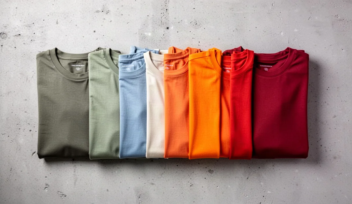

Stand two people side by side wearing the exact same navy blazer, and one will look like they stepped out of a tailor's window while the other looks like they grabbed whatever was clean. The blazer is not the variable. What sits next to it, above it, and below it is. Color combinations do more work than fabric quality or price tag in deciding whether an outfit reads as considered or accidental.
This is not about buying a color wheel poster or memorizing fashion rules. It is about understanding a handful of principles that colorists, painters, and stylists all use, then applying them the same way you'd adjust the salt in a recipe: by taste, but with an understanding of why too much or too little throws things off. This article breaks down what actually makes a palette look costly, and gives you a repeatable way to check your own outfits before you walk out the door.
What People Actually Mean by an Expensive Look
When someone says an outfit "looks expensive," they rarely mean the price. They mean the colors seem chosen on purpose rather than assembled by coincidence. A cheap-looking outfit usually has one of three problems: colors fighting each other, colors that are technically "matching" but slightly off in tone, or too many competing ideas happening at once.
Think of it like a restaurant plate. A $40 entrée and a $12 diner plate can have the same three ingredients, chicken, greens, and a starch, but the $40 plate places them with intention: colors contrast just enough to look appetizing, nothing bleeds into another, and portion sizes are balanced. The diner plate might have the same calorie count but everything is piled together with no thought to how it looks next to itself. Clothing works the same way. Price has nothing to do with it; arrangement does.
The three biggest levers that control this perception are saturation, undertone matching, and contrast level. The rest of this article unpacks each one, because once you understand how they work together, you can diagnose almost any outfit that feels "off" in under a minute.
How Saturation Changes the Perception of an Outfit
Saturation is how intense or muted a color is. A fire-engine red and a brick red contain the same hue family, but the fire-engine version is fully saturated and the brick version is dialed down, closer to a clay or terracotta. Expensive-looking outfits tend to lean toward muted, slightly desaturated colors: olive instead of neon green, camel instead of orange, charcoal instead of pure black.
Why does this read as higher quality? Fully saturated colors are harder to produce consistently and harder to wear without looking costume-like, so our eyes associate them with mass-market dyeing processes, think fast-fashion primary colors versus the slightly grayed-down tones found in wool coats or raw-dyed denim. Muted tones also hide synthetic sheen better, which is part of why cheaper polyester blends often get dyed in loud, saturated colors to begin with: the brightness distracts from the fabric's flatness.
Here's a simple comparison most people can picture immediately: a bright royal blue polo next to a slightly faded, dusty blue chambray shirt. Same color family, completely different impression. The dusty version looks like it's been worn and cared for over time; the royal version looks like it just came off a clearance rack.
- High saturation: neon green, fire-engine red, electric blue, bright fuchsia
- Low saturation (often read as "expensive"): olive, brick, slate blue, dusty rose, camel
This does not mean saturated colors are forbidden. A single saturated piece, a red handbag or a cobalt scarf, can work as a deliberate accent. The problem starts when two or more fully saturated colors compete in the same outfit; that's when things start to look like a toy box rather than a wardrobe.
Why Matching Warm or Cool Undertones Matters
Undertone is the subtle warm or cool cast hiding underneath a main color. It's the reason two "whites" can look mismatched when worn together, one has a yellow undertone, the other a blue-gray one, even though both are labeled "white" on the tag. The same hidden layer exists in beiges, grays, greens, and even blacks.
A fast way to check undertone is to look at how a color behaves next to something obviously warm (like gold) or obviously cool (like silver). Hold a sweater next to both. If it visually "agrees" more with gold, it likely has a warm undertone, warm beige, cream, olive, rust. If it agrees more with silver, it's probably cool, think icy gray, true navy, or blue-based green.
Mixing undertones within the same outfit is one of the most common reasons two colors that should "match" on paper end up looking muddy or slightly wrong in person. A warm camel coat over a cool-toned gray sweater can create a faint visual static, even though camel and gray are a classic pairing. The fix is usually to pick a gray with warm undertones (a "greige," which leans slightly brown) to bridge the two.
| Color | Warm version | Cool version |
|---|---|---|
| White | Ivory, cream | Bright white, icy white |
| Gray | Greige, taupe-gray | Charcoal, slate |
| Green | Olive, moss | Emerald, teal-green |
| Red | Brick, rust | Cherry, true red |
If you're not sure which undertone a piece has, natural daylight is the most reliable place to check; indoor bulbs, especially warm-toned LED or incandescent lighting, can shift how a color appears by making cool tones look slightly warmer than they are.
Contrast: How Much Is Too Much
Contrast is the difference in lightness and darkness between colors, not just the colors themselves. A black blazer over a white shirt is high contrast. A charcoal blazer over a light gray shirt is low contrast. Both can look expensive, but they create very different moods, and mismatching contrast levels within one outfit is a common way looks go wrong.
High contrast (think black-and-white, navy-and-cream) tends to look sharp, formal, and graphic. It photographs well and reads as intentional because it mimics the kind of tonal control seen in tailoring and editorial styling. Low contrast (tonal dressing, like wearing three shades of beige or three shades of gray) tends to look quiet, expensive, and calm, the kind of look associated with minimalist designers because it requires precise fabric and dye matching to pull off without looking flat.
The mistake most people make is landing in the middle: medium contrast with no clear direction, like a mid-gray shirt with a mid-brown jacket. Neither tonal nor graphic, it just looks indecisive. A simple fix is picking a lane for the day: go noticeably light-to-dark (high contrast) or stay within one or two shades of each other (low contrast, also called tonal dressing).
- High contrast outfit: white shirt, black trousers, black shoes
- Low contrast (tonal) outfit: oatmeal sweater, camel trousers, brown boots
- Muddled middle (to avoid): gray-green shirt, medium-brown pants, navy shoes with no repeating tone
Simple Color Pairings That Work Every Time
Once saturation, undertone, and contrast are understood, a few combinations consistently read as put-together regardless of trend cycles. These aren't rules carved in stone, but they are a reliable starting point, similar to knowing that lemon and fish usually work before you start experimenting with more complex pairings.
- Navy and camel: cool and warm, but the deep value of navy keeps it grounded; a classic trench-coat pairing.
- Gray and burgundy: a muted neutral with a deep, desaturated red; works for both casual and formal settings.
- Olive and cream: warm-neutral pairing, low-to-medium contrast, common in outdoor and military-inspired pieces.
- Black and white: maximum contrast, works best when fabrics are matte rather than shiny to avoid looking cheap.
- All tonal beige/brown: three shades of the same warm family, requires attention to undertone matching above all else.
Notice that none of these pairings include two highly saturated colors together. That combination, say, bright purple with bright orange, can work in art or design, but in clothing it almost always needs a muted third element (a neutral shoe, bag, or outerwear piece) to keep it from looking like a costume.
A Checklist for Testing Your Outfit's Color Balance
Before leaving the house, run through this short list. It takes less than a minute once it becomes habit.
- Count your saturated colors. If more than one piece is fully saturated (not muted), consider swapping one for a neutral.
- Check undertones in daylight. Hold pieces together near a window, not under indoor bulbs, which can distort warm/cool perception.
- Decide your contrast lane. Are you going high contrast (light against dark) or tonal (similar shades)? Avoid sitting in the middle.
- Look at your shoes and bag last. These are often the most saturated or mismatched undertone pieces because they're bought separately from outfits.
- Step back five feet. Up close, small clashes are invisible; at a normal conversational distance, they become obvious.
Common mistakes
The most frequent error is pairing two saturated colors without any neutral to separate them, turning an outfit into a competition rather than a composition. A close second is mismatching undertones in neutrals, assuming all "whites" or all "grays" automatically go together when they often don't. A third is wearing fabrics with high shine (certain polyesters, cheap satin) in saturated colors, which amplifies the "inexpensive" effect because light bounces unevenly off the surface. Lastly, many people change contrast levels piece by piece without noticing, ending up in that muddled middle zone that reads as accidental rather than deliberate.
Where to Go From Here
Start small: pick one outfit already in your closet and run it through the five-point checklist above. Note which lever, saturation, undertone, or contrast, is causing the issue, then adjust just that one variable before buying anything new. Most wardrobes already contain expensive-looking combinations; they're just not being paired correctly yet.
If color choice continues to feel confusing despite understanding these mechanics, a session with a professional stylist or color consultant can help identify which undertones and saturations work best against your specific skin tone and existing wardrobe, this is a matter of personal calibration, not a universal formula, and a trained eye can shortcut a lot of trial and error.